After doing
research on digi-paks for existing pop artists/bands we have began planning on how we want ours to look.
Here is the template of the digi-pak.
Below is my idea of what we may want our final digi-pak to look like.
When we were taking the stills of the girls we used similar lighting in which we used for our music video. We used the gold cover on the reflector for this which created an overall glow on the girls faces and a shadow on the wall in the background. The gold glow is in every photo that we wish to use will keep a strong colour theme running through out. This colour will also help to link to the pop genre that we wish to convey. For the back of the digi-pak, we plan to put two individual photos of the girls together using photoshop and then adjusting the levels of brightness and contrast to darken the photo of the girls. The gold theme will still occur as the wall behind has a gold glow to it. We will use the same font for the list of tracks which will be in black or white depending on what we thinks looks best.
The photos which we may wish to use on these can be found below.

The photo which we may chose to use for the front cover (bottom right of the template) is this one. I think it'd be good to use this photo for the front cover rather than the one below as there is a 'professional' aspect to it as someone took the photo of us whilst we were doing a fixed pose. Whereas the other image was taken by Siobhan. I think this would be good to use in a panel inside our digi-pak rather than the front cover. The lighting also adds to the professional part of the album cover as we thought about if we were going to use a reflector, what cover we would use for it and most importantly, how we were going to position the lighting. We chose to use the gold cover for the reflector in order to convey the pop genre. The shadows created by the light also add a really good effect. The girls are smiling in this photo which gives the audience an idea that our artists are fun-loving and energetic, the star persona that we wish to convey.

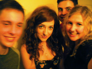
I feel the image to the right shouldn't be used as the front cover because we have not experimented with any lighting and we took the photo of ourselves which makes it seem very unprofessional. Instead, I think it would be better to be used for the fold in panel. (Bottom left of the template) By using a photo that the girls had taken of themselves in our final digi-pak would give the right impression that we want to give to the audience. We want to mainly show them that our artists are fun-loving and energetic. It also shows that they know how to have a laugh and don't take everything seriously. We will have to use photoshop to adjust the brightness, contrast and possibly the saturation in order to make this photo have a gold tinge to it to continue the colour scheme.


Looking over the images we had taken, we noticed that one of me was a little dark. We then decided that we could edit the image so that you couldn't see the face at all. We were planning on using this for the back cover of our digi-pak (Bottom middle of template) and therefore decided both artists should be in it. We found a similar photo of Siobhan and we plan to copy Siobhan onto the image with Brianna. We then thought about adjust the levels of brightness and contrast for both girls so that you can't see their faces. By only adjusting the levels of the girls, the gold glow on the wall created by the torch and reflector will remain the same. We want the gold glow to remain in the final image as it links to the pop genre and will create a strong colour scheme running throughout the final digi-pak.
We are unsure as to what font we will be choosing to use but we will be picking one that will reflect the pop genre for example, the colour may be yellow, orange or gold. We will also be using the same one for the front cover so that there is a theme.

We are still undecided as to what images we may chose to use for the inside of our digi-pak although I feel we could maybe use the two on the right or similar ones. The lighting is the same as the other photos that we may chose to use so that there will be a link and a strong colour scheme running throughout. I feel that it shows that the girls like to have a laugh and a good time as they're not smiling or doing a fixed pose for these two images. Instead, they're messing about and pulling silly faces which shows how fun-loving and energetic they are which again, links to our star persona.

Instead of filling our digi-pak with just pictures of our artists we decided to use an image we had taken whilst experimenting with our lighting. I think this photo would look good on the disc panel (Top middle of the template) This would also link with the pop genre as the lighting is shining towards the camera and has a slight gold glow to it. The thumb and index finger have also created a circular shape which we can then place around the centre of the disc panel as shown in the image I have drawn at the start of this blog post.
Overall whether we choose to use these selected images or not, we plan to keep a strong gold colour theme running throughout in order to help convey the pop genre and we plan to give the audience the impression that our artists are fun-loving and energetic.


.jpg)


